Project: VUSE DVC Packaging
Client: R.J. Reynolds
Disciplines: Structural Design | Packaging & Branding
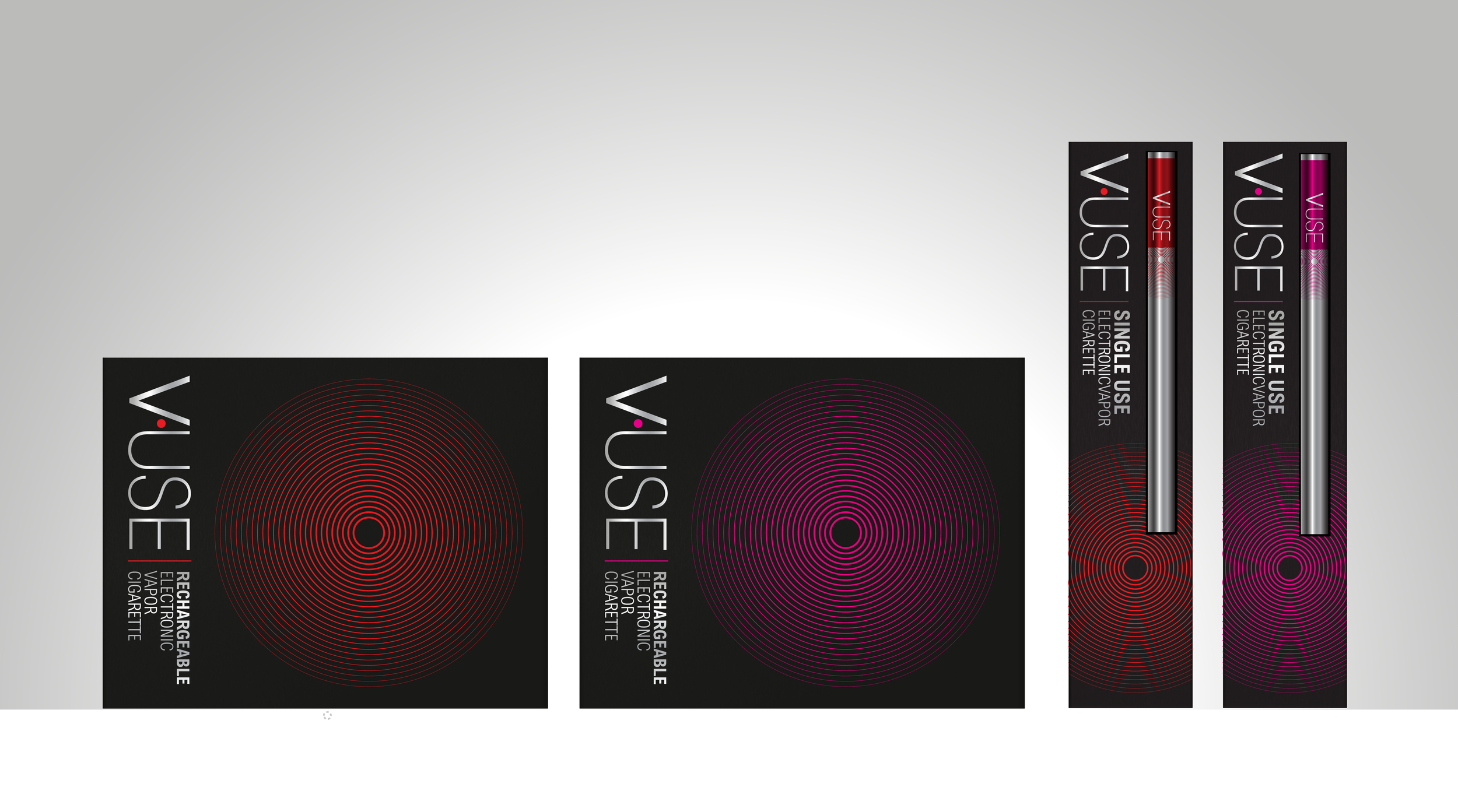
HEROING AN ICON
A category defining product with an on-shelf presence to match.
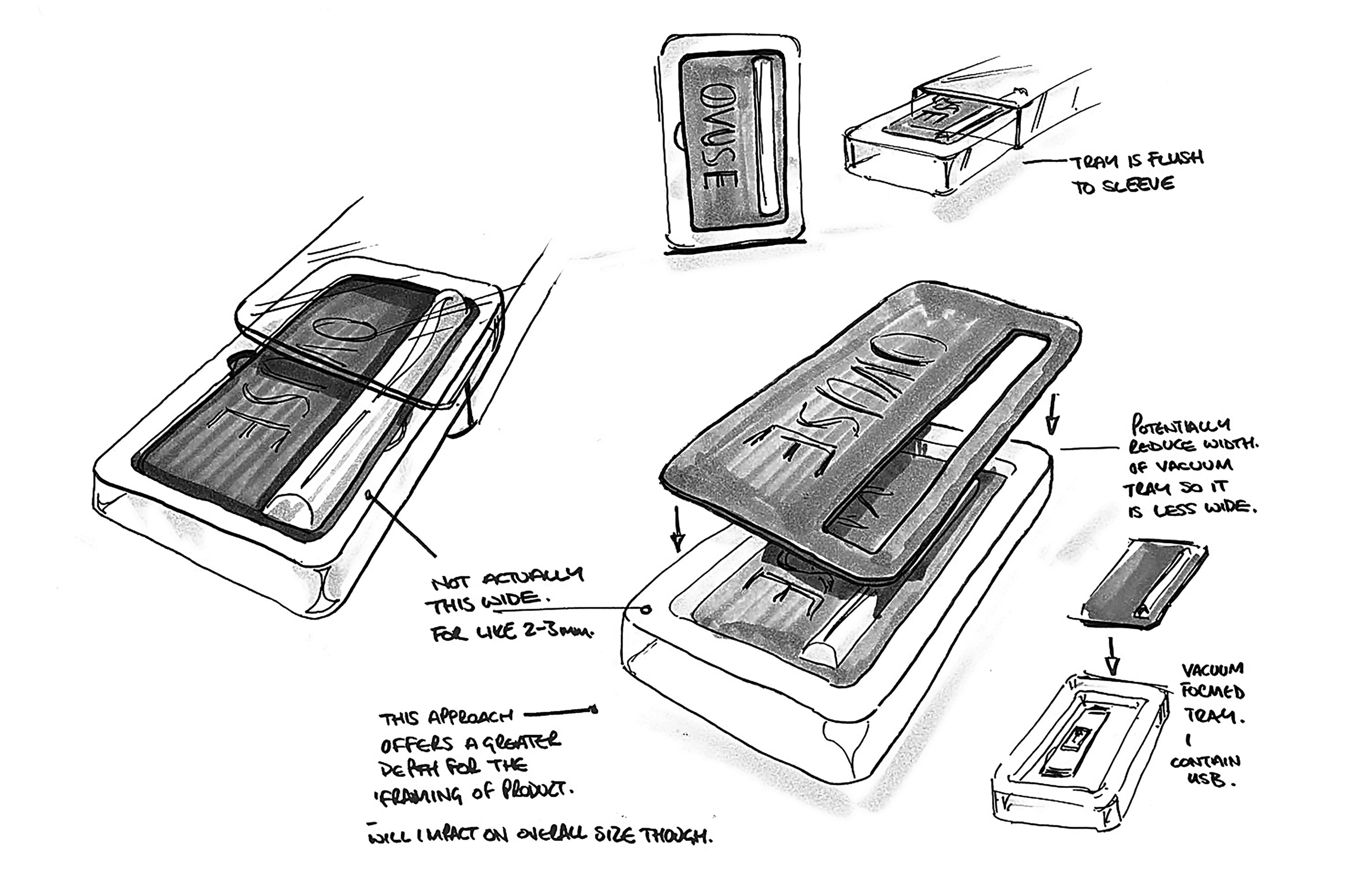
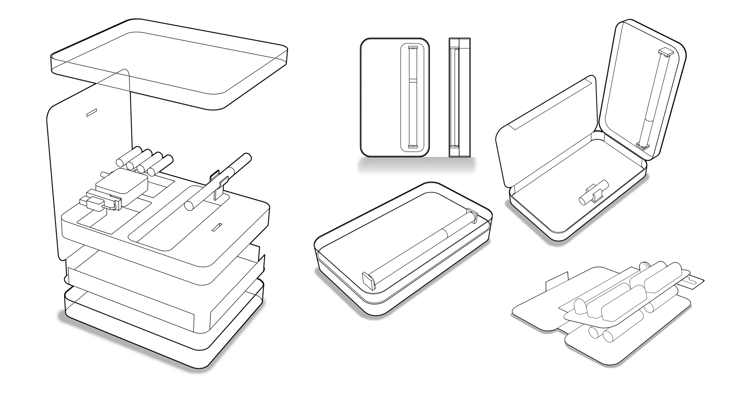
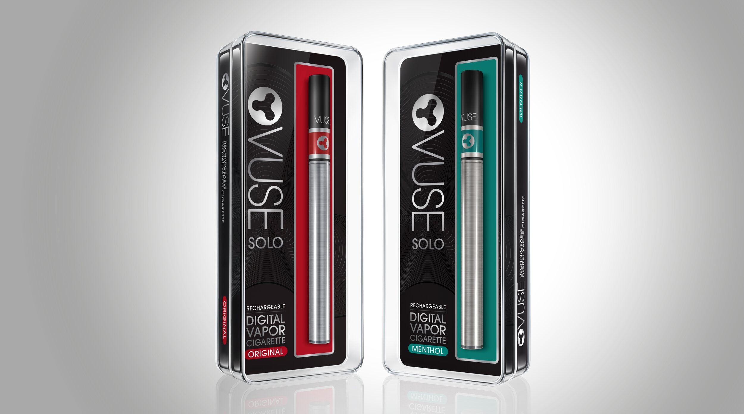
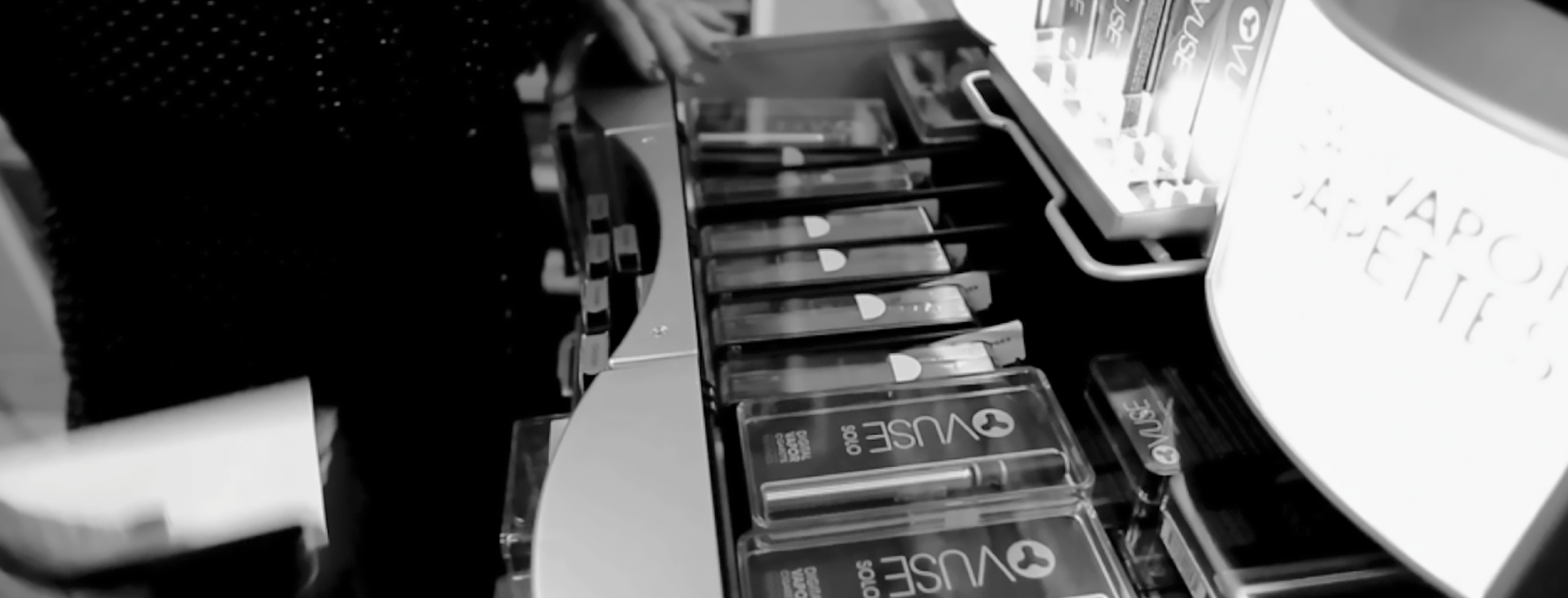
In a rapidly growing and a highly competitive retail environment, a strong on-shelf presence was paramount. Unlike other e-cigarette brands, VUSE had the advantage of big tobacco, earning its responsible position on kiosk back bars. Although its rightful home, structurally, this presented its own set of challenges, merchandising in an area originally intended for packaging half its size.
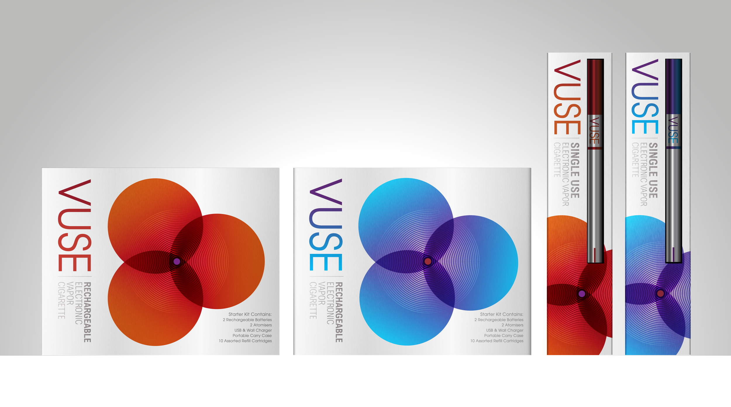
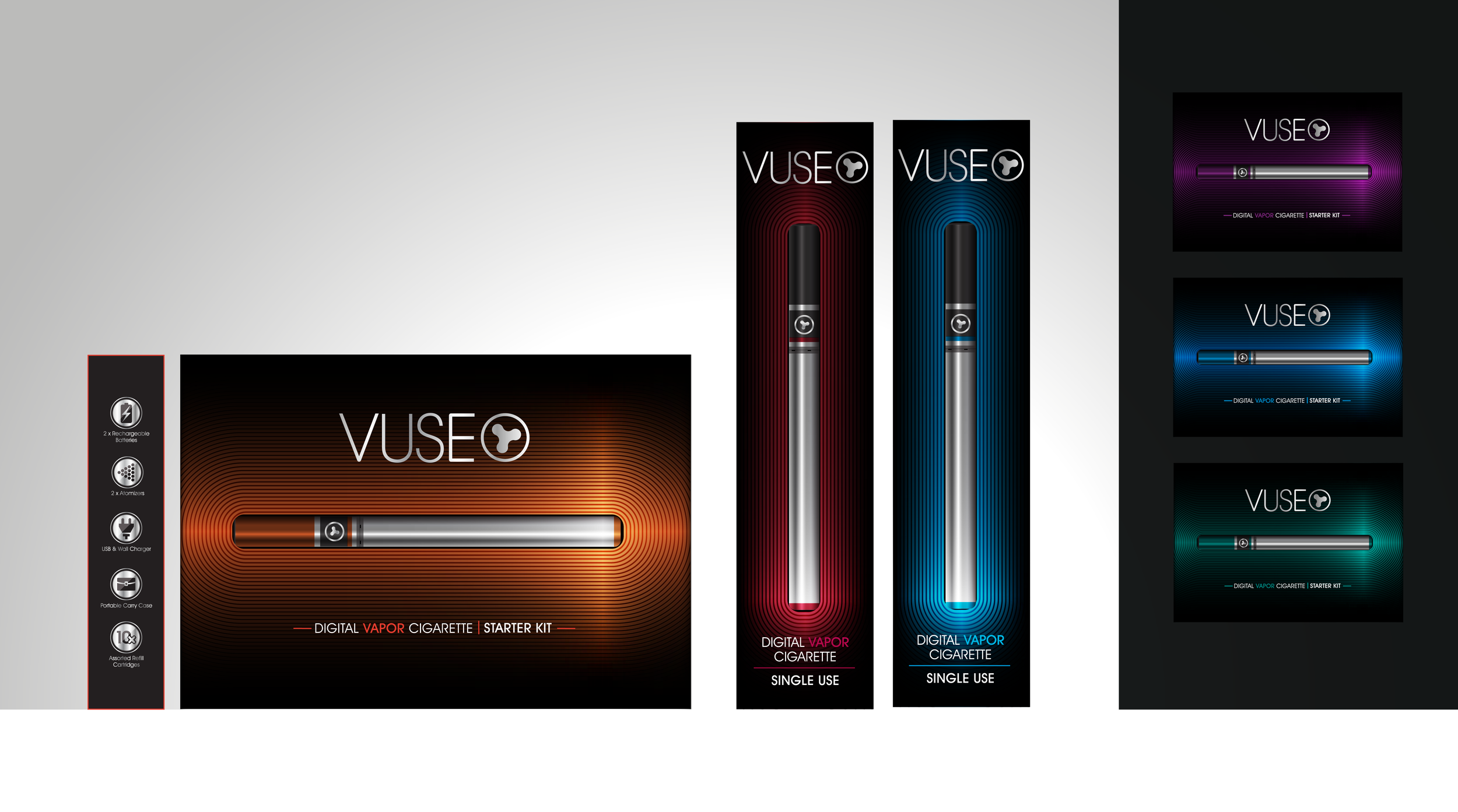
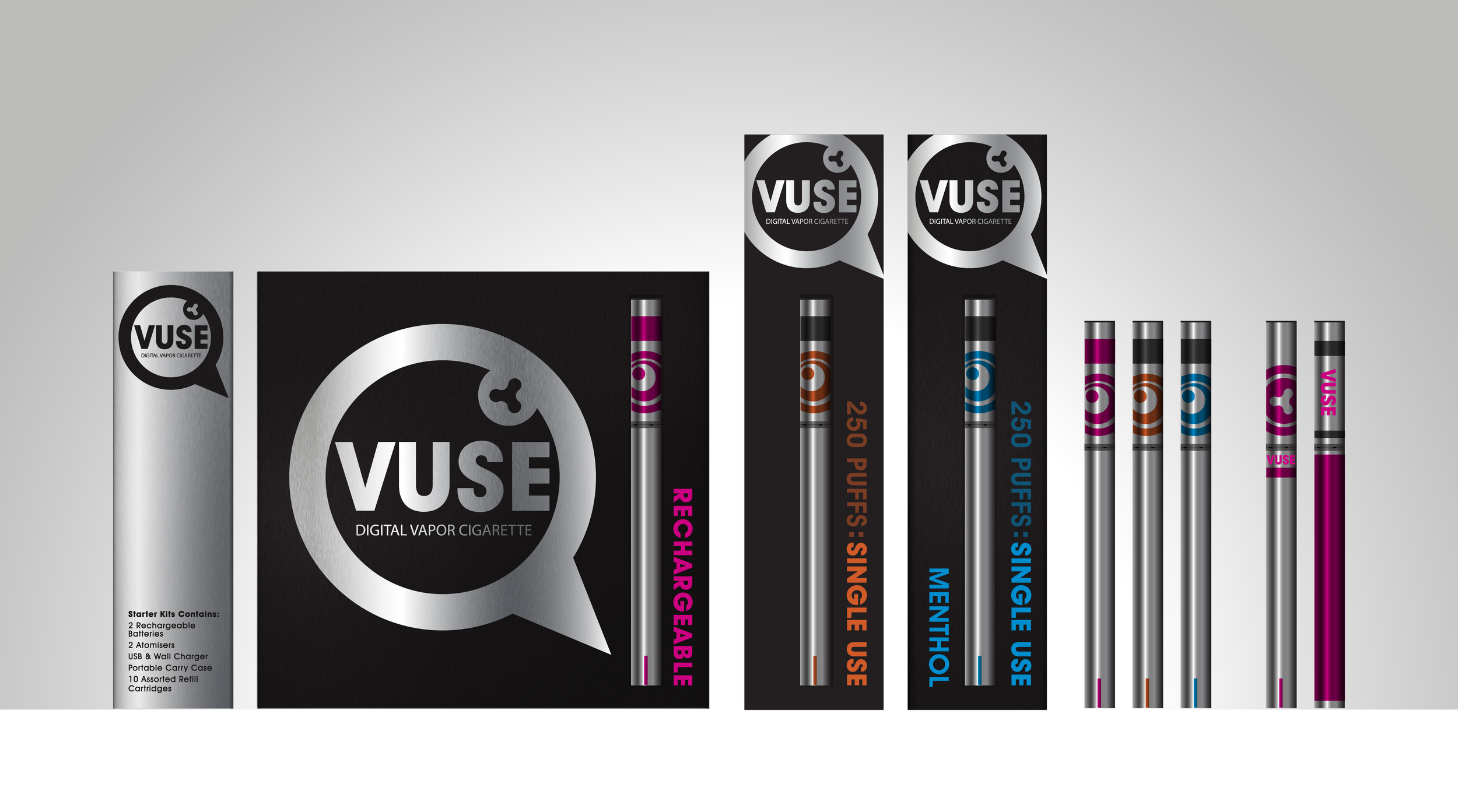
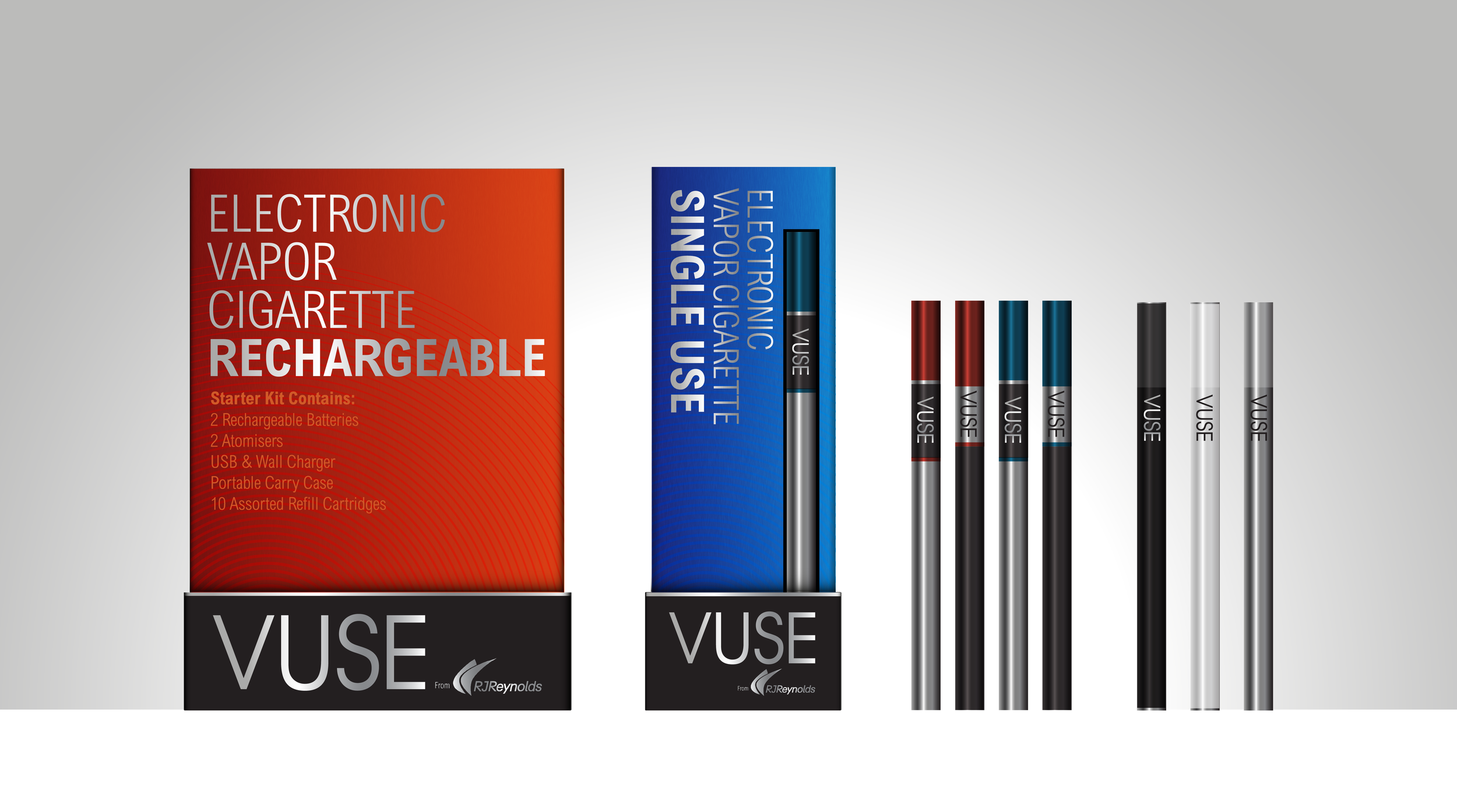
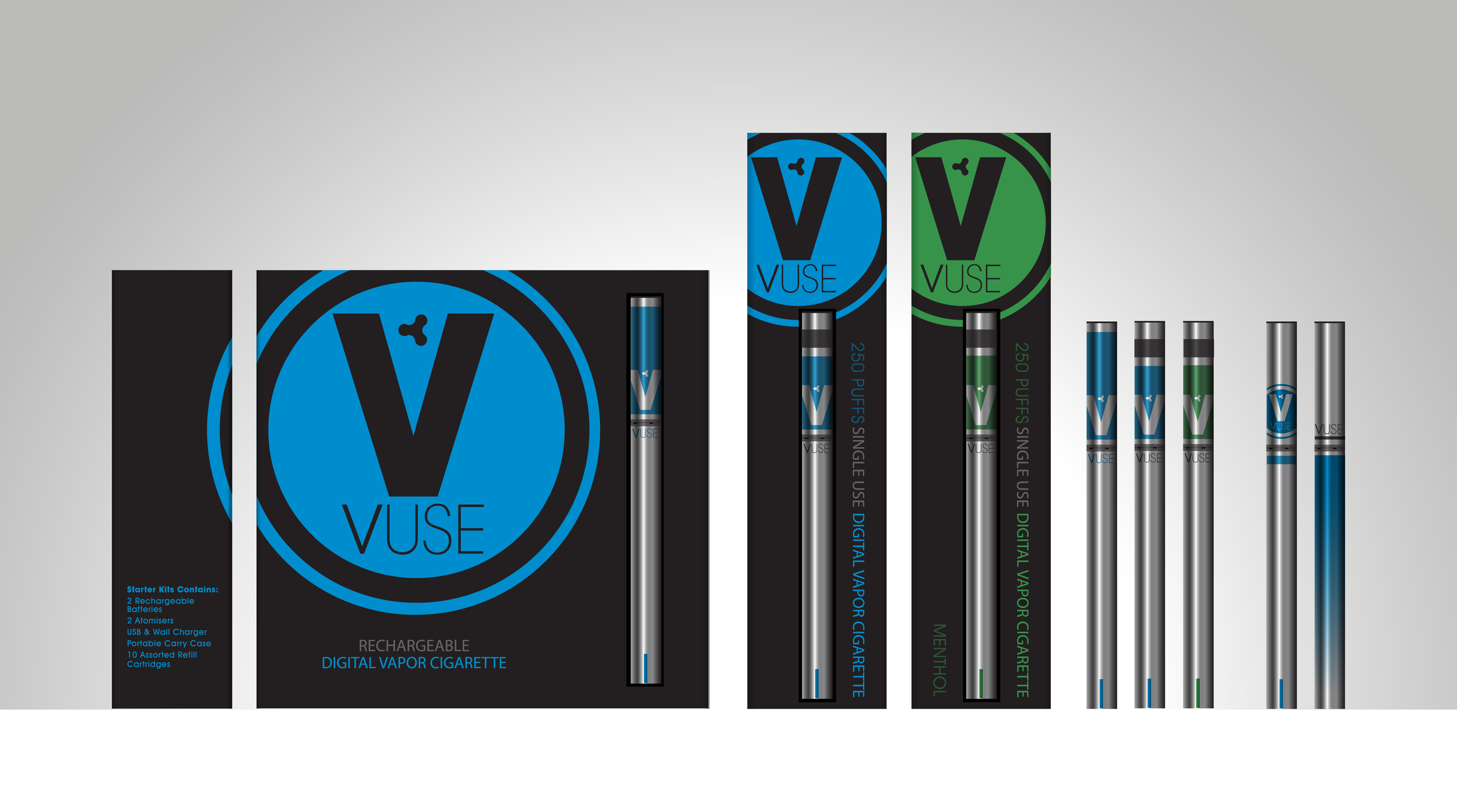
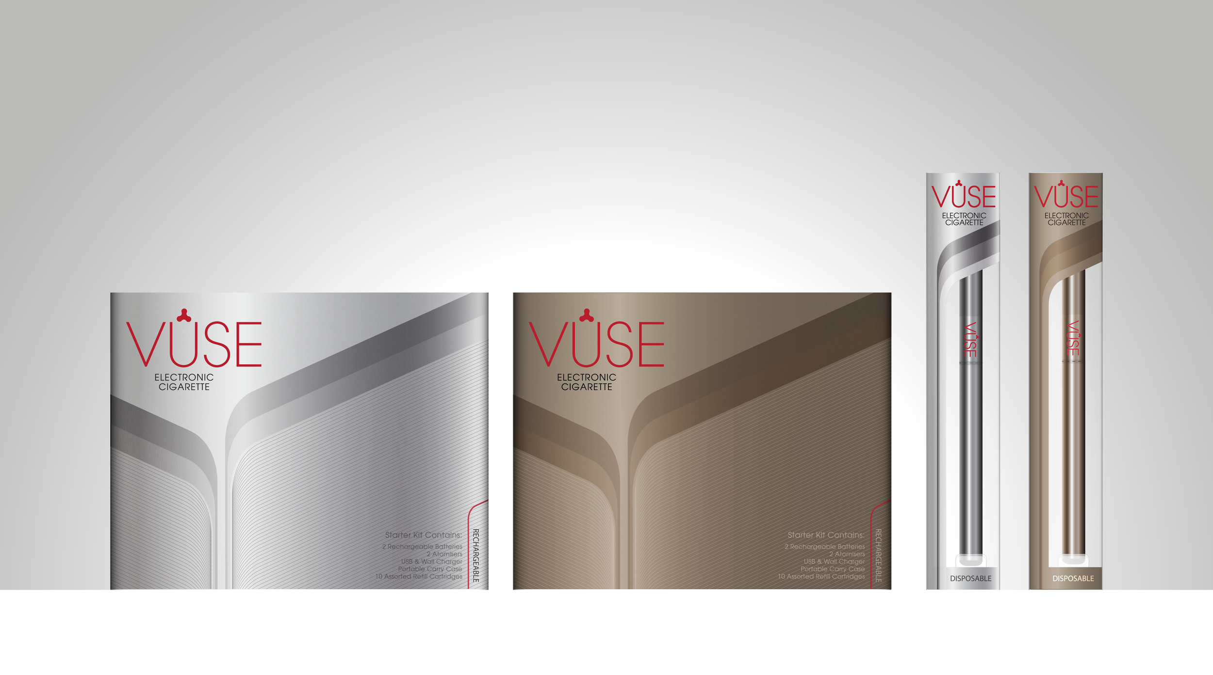
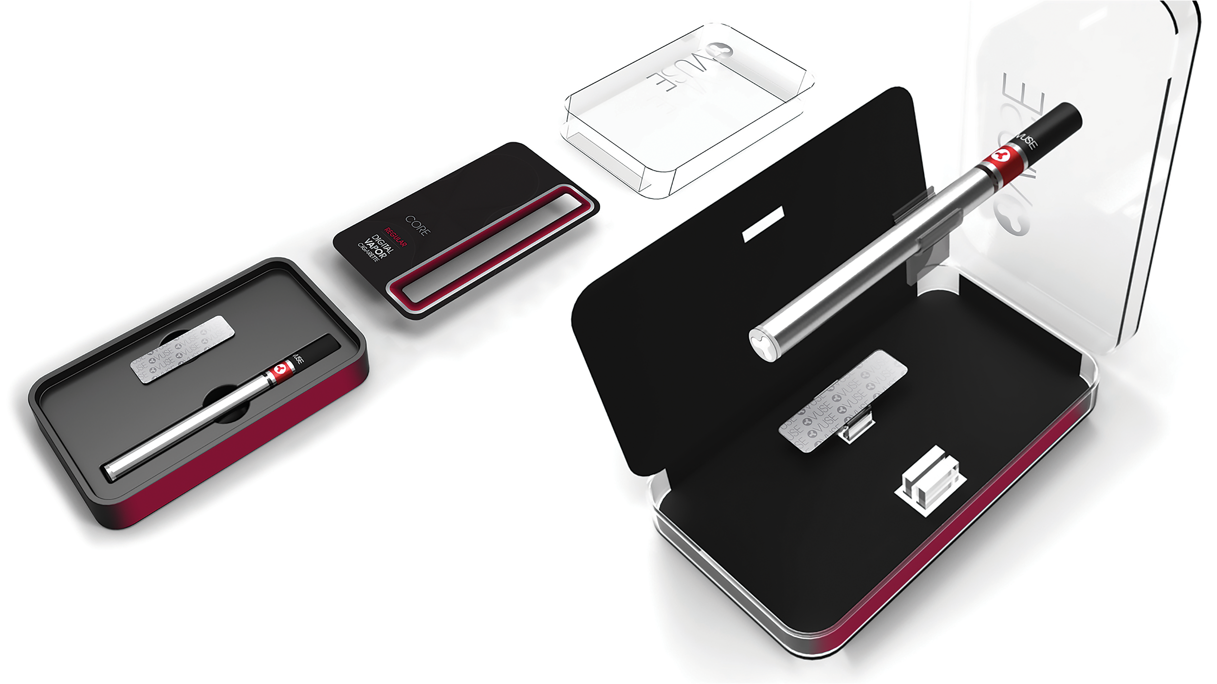
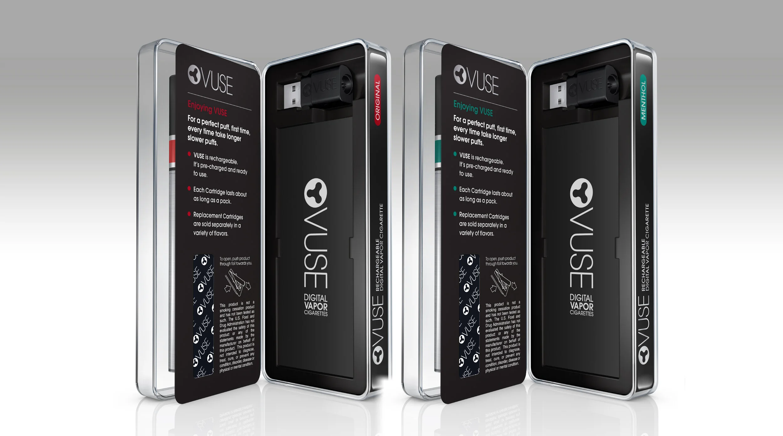
We always felt it was important to show the product, imbuing it with a sense of preciousness by elevating and heroing it - a competitive advantage over its chinese imported rivals, which were sold unassembled and visually generic, both structurally and aesthetically.
Housed in bespoke polycarbonate casing, this preciousness plays a crucial role in setting consumer expectations, reinforced through an unboxing ritual that reflects both the technological superiority of the product and the premium cues signalled by the brand.
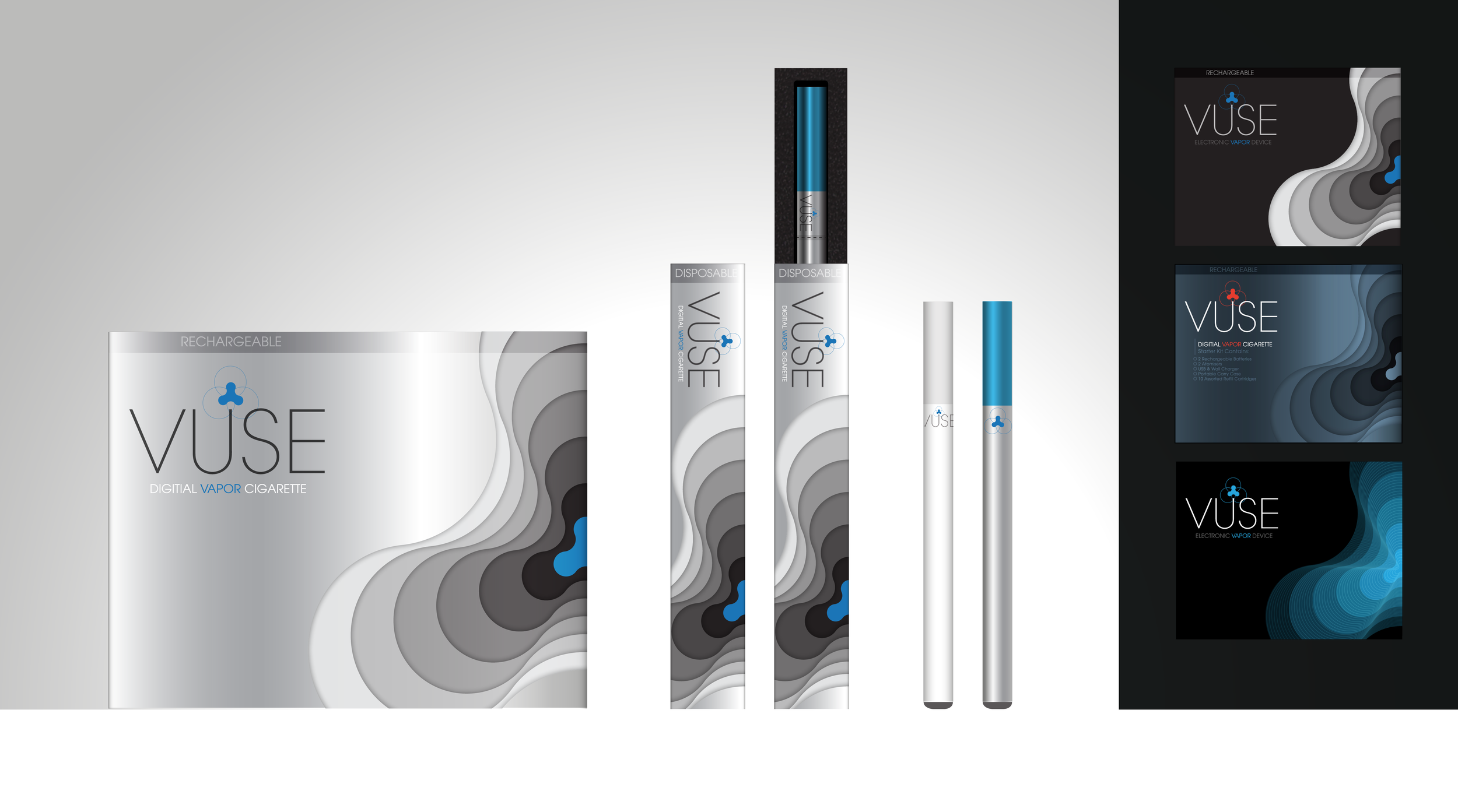
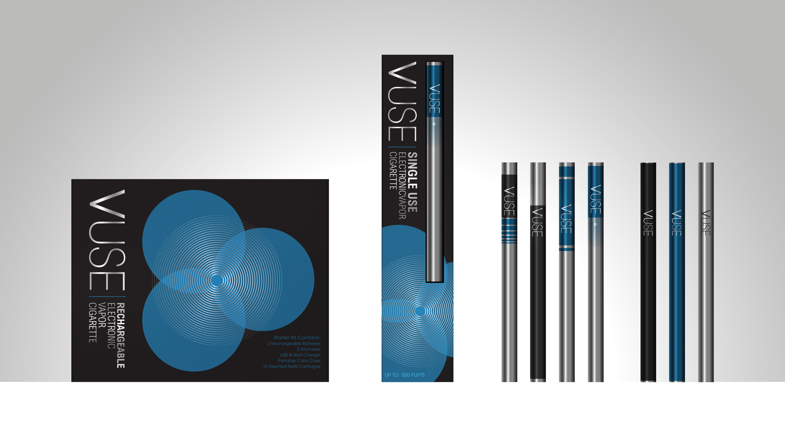
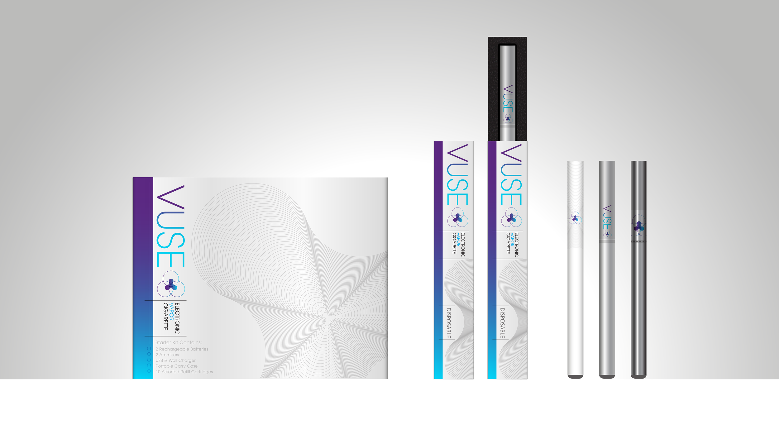
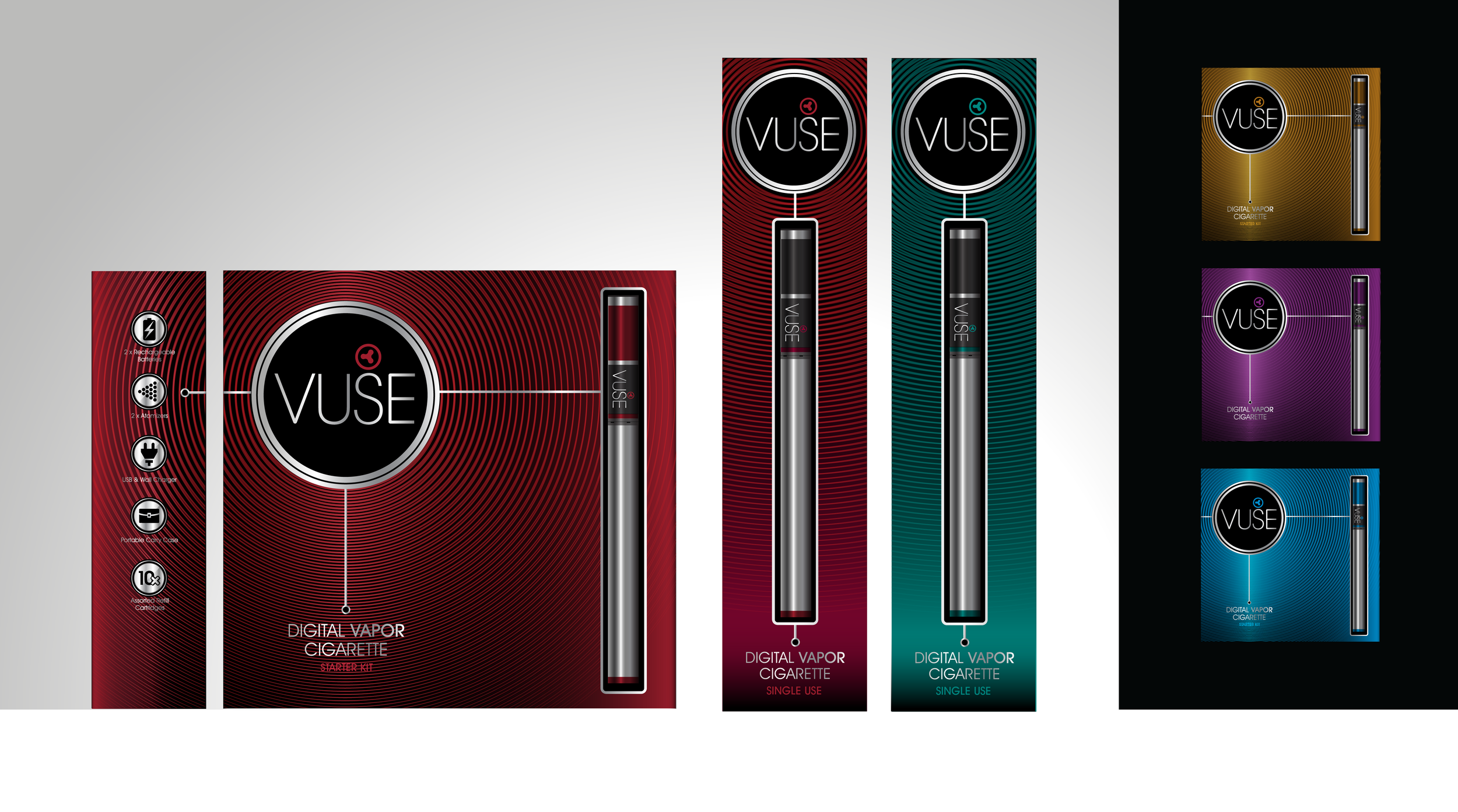
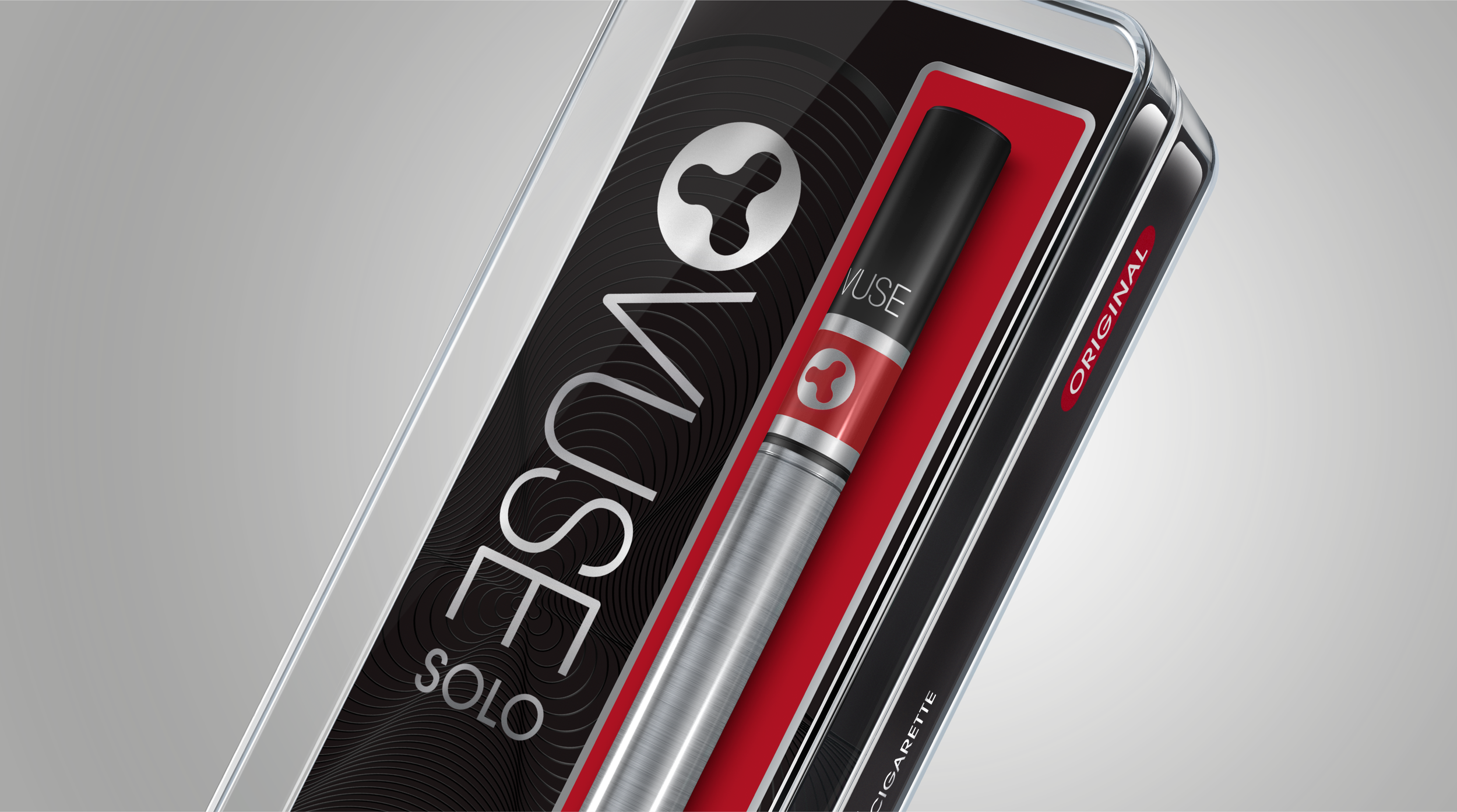
VUSE embodies its impactful and confident design, referencing its tobacco ancestry with intricate detailing, spot varnishing and foiling but clearly proud of it’s future facing identity.
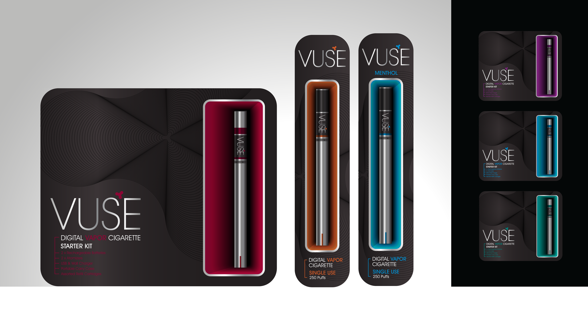
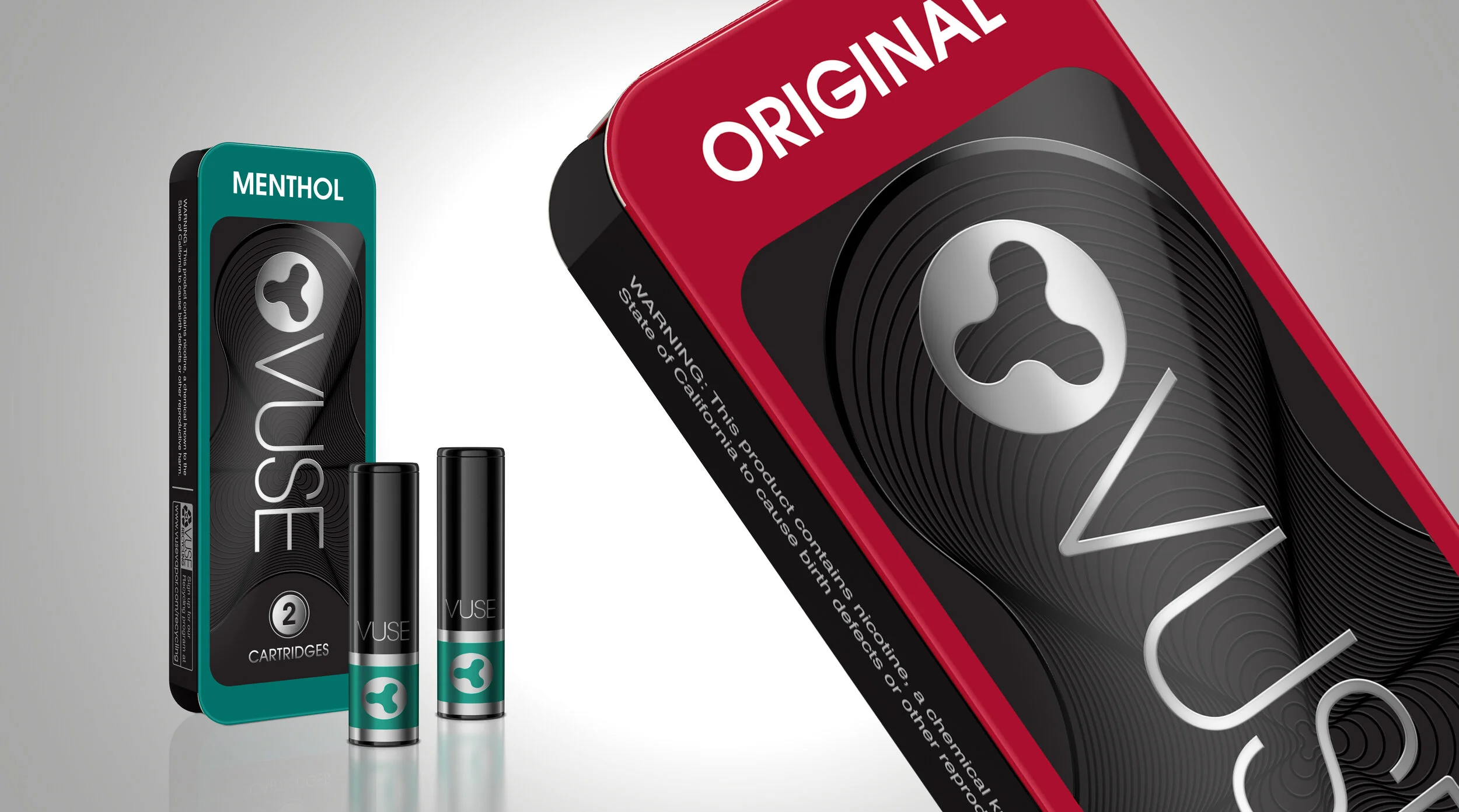
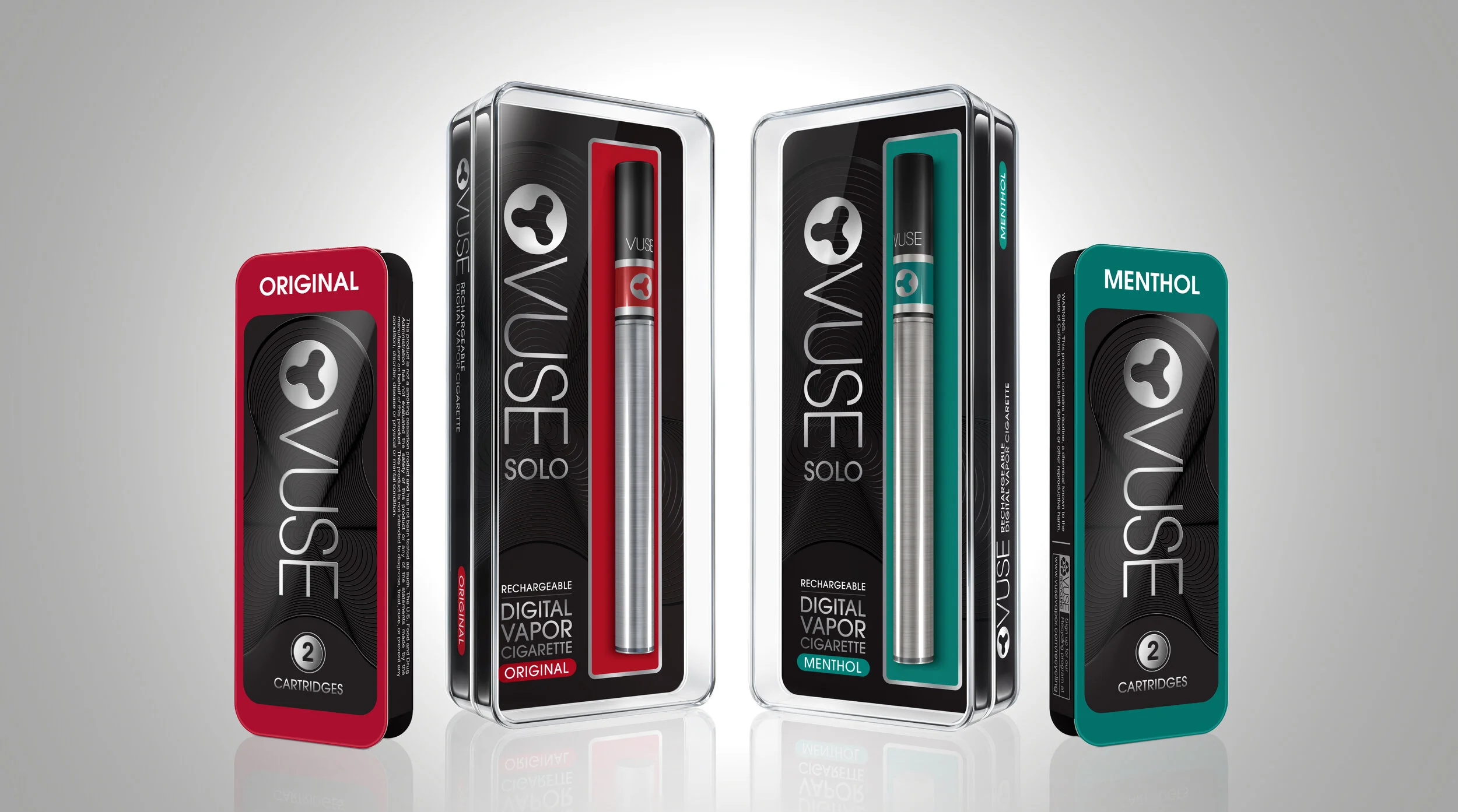
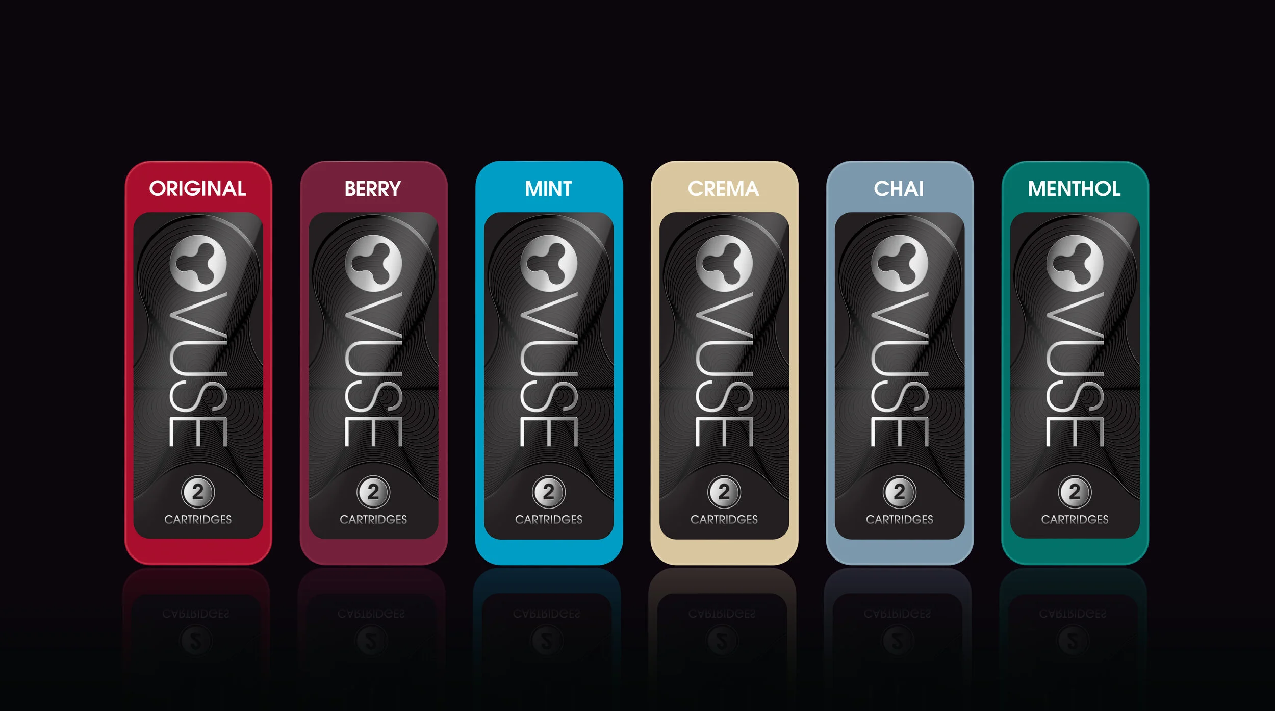
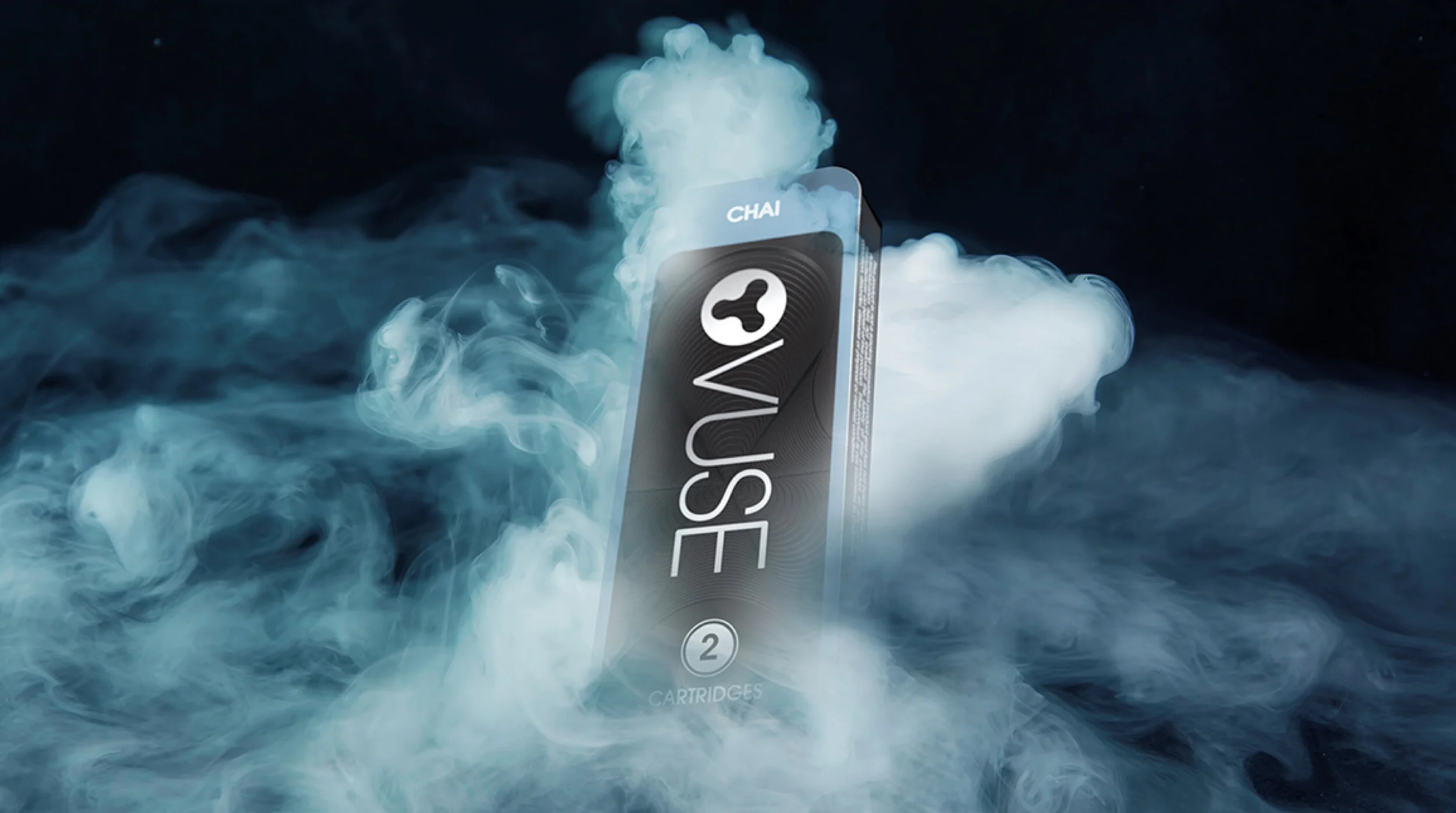
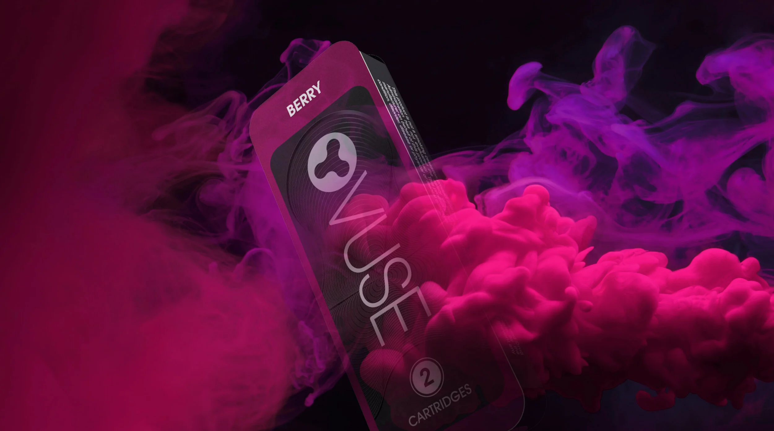
Cartridge packaging reflects its partner with consistent brand aesthetics but structurally using a more immediate, disposable card sub-straight to reflect its repeat purchase ritual, while strong colour coding enables easy navigation of flavours.